
Vodafone New Zealand
I joined the Vodafone Digital team for a period of three months in 2012 as Lead UX Designer. During that time I was involved in their Strategic Redesign project, establishing a consistent visual language online and implementing new UI elements to replace their mismatched and outdated styles that were the remnants of grandfathered management systems and several global brand redesigns. This page showcases some of that work as incomplete and without much context, as only a few elements survive today.
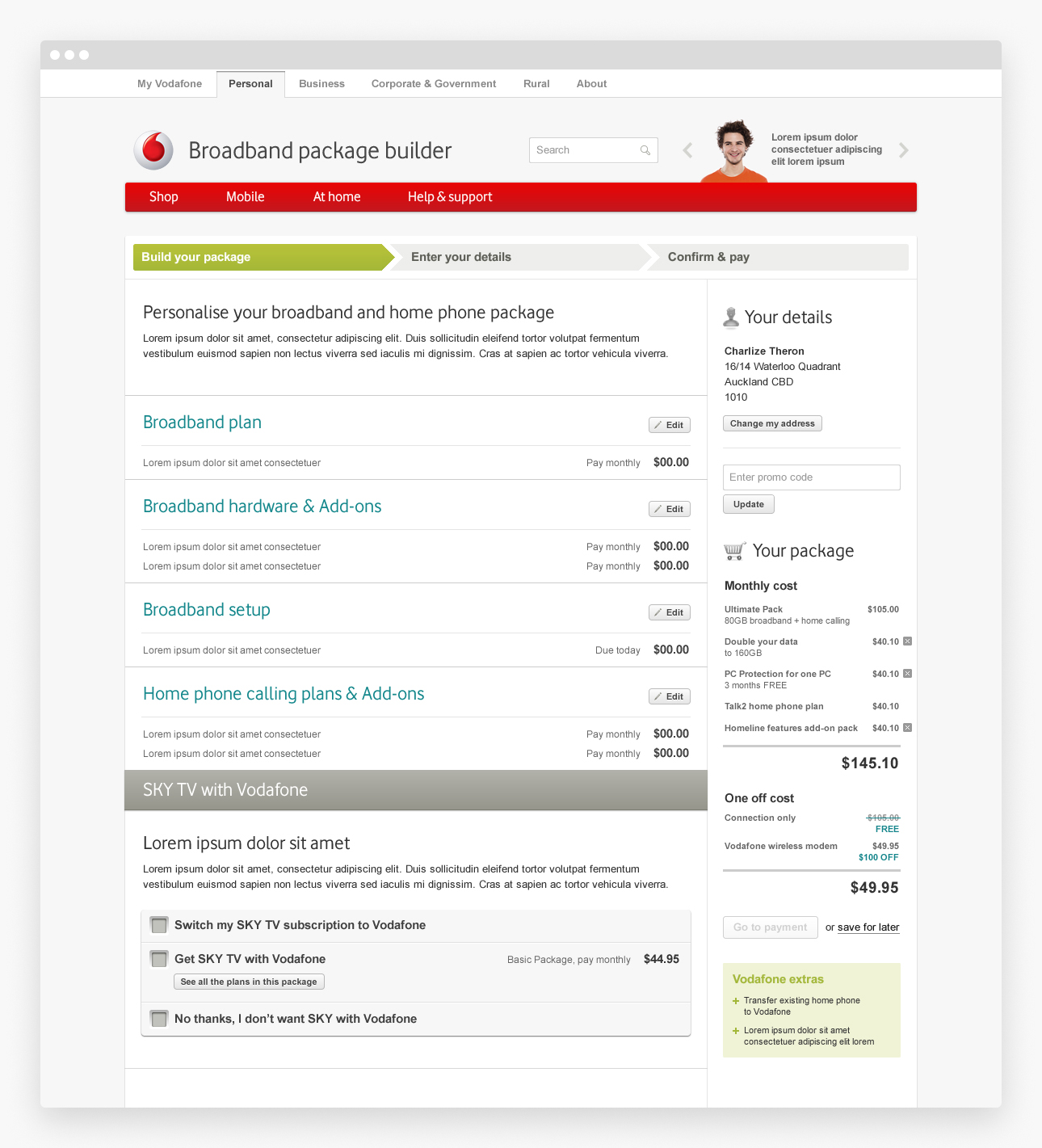
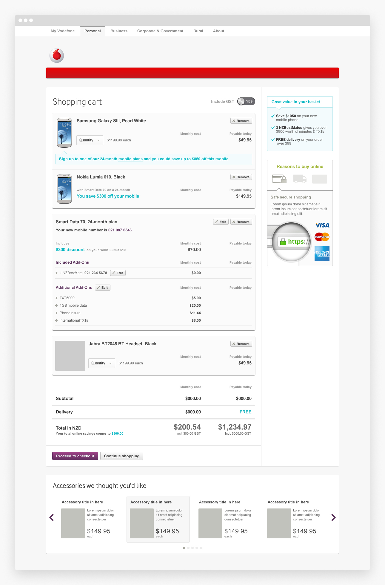
By far the biggest piece of work—and my favourite—was a complete overhaul of Vodafone's online checkout process. Before the introduction of their simplified Red plans, Vodafone had a complicated array of broadband, home phone & TV packages, so a step–by–step tool was developed to accommodate a staggering array of package combinations; collecting customer information along the way and guiding them through to the final checkout. An accordion–style form resulted in a massive online form being broken into small, manageable bits to reinforce a sense of accomplishment as the user completed each section quickly. The sidebar featured an overview of the user's selected package options, including costs and savings & benefits.
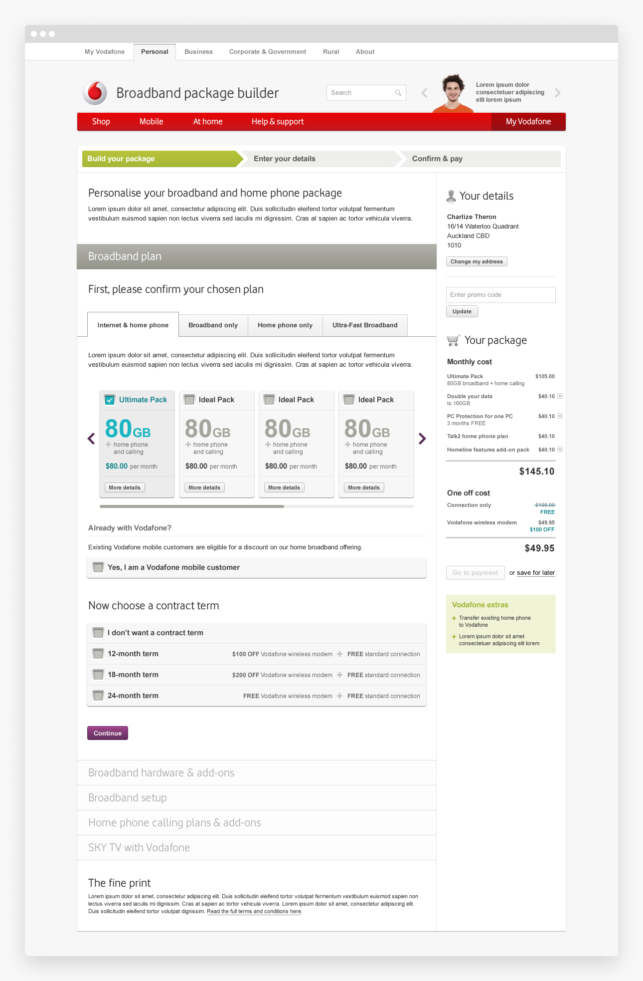 Broadband Package Builder
 Broadband Package Builder
 Broadband Package Builder
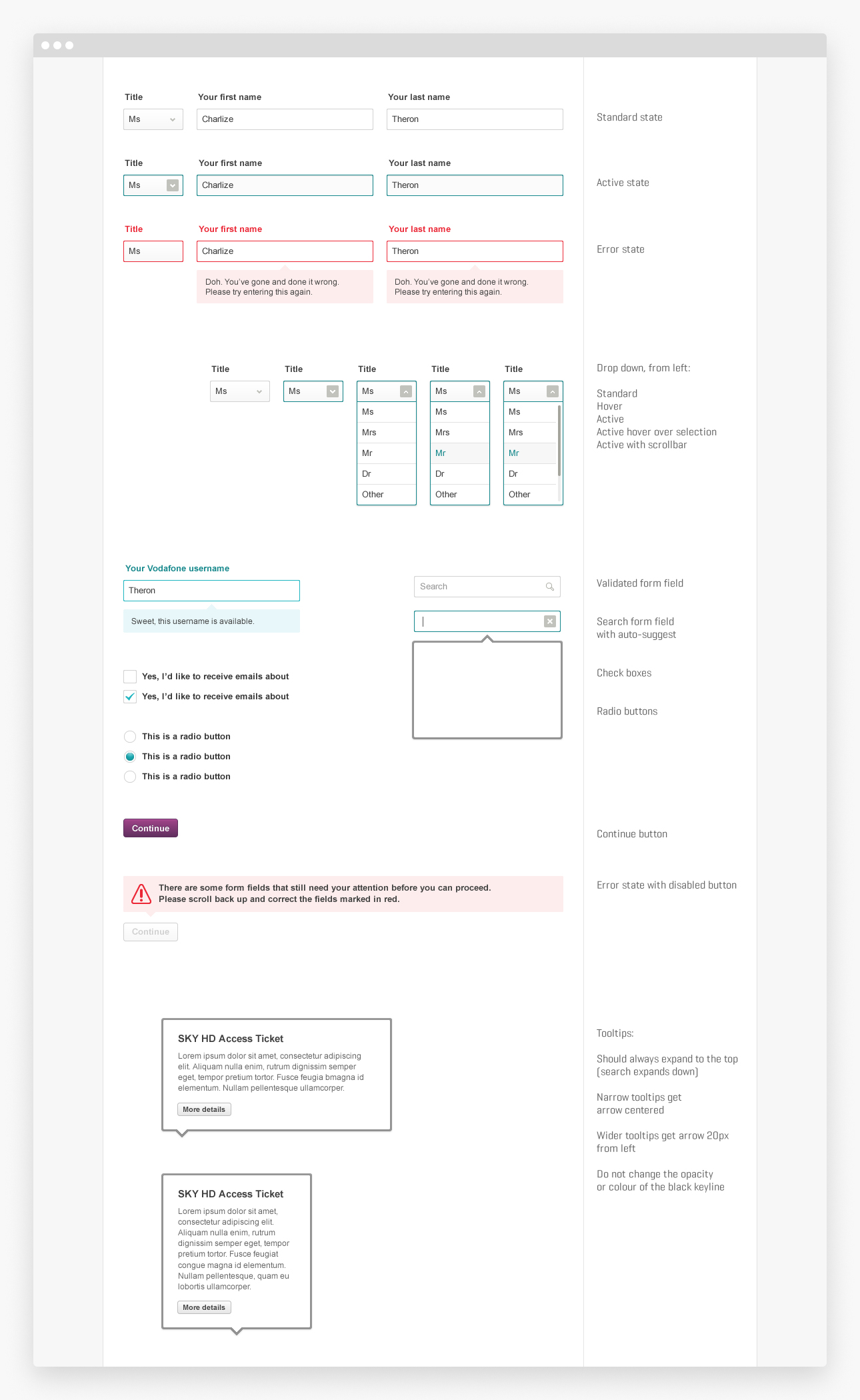 Basic UI element styleguide
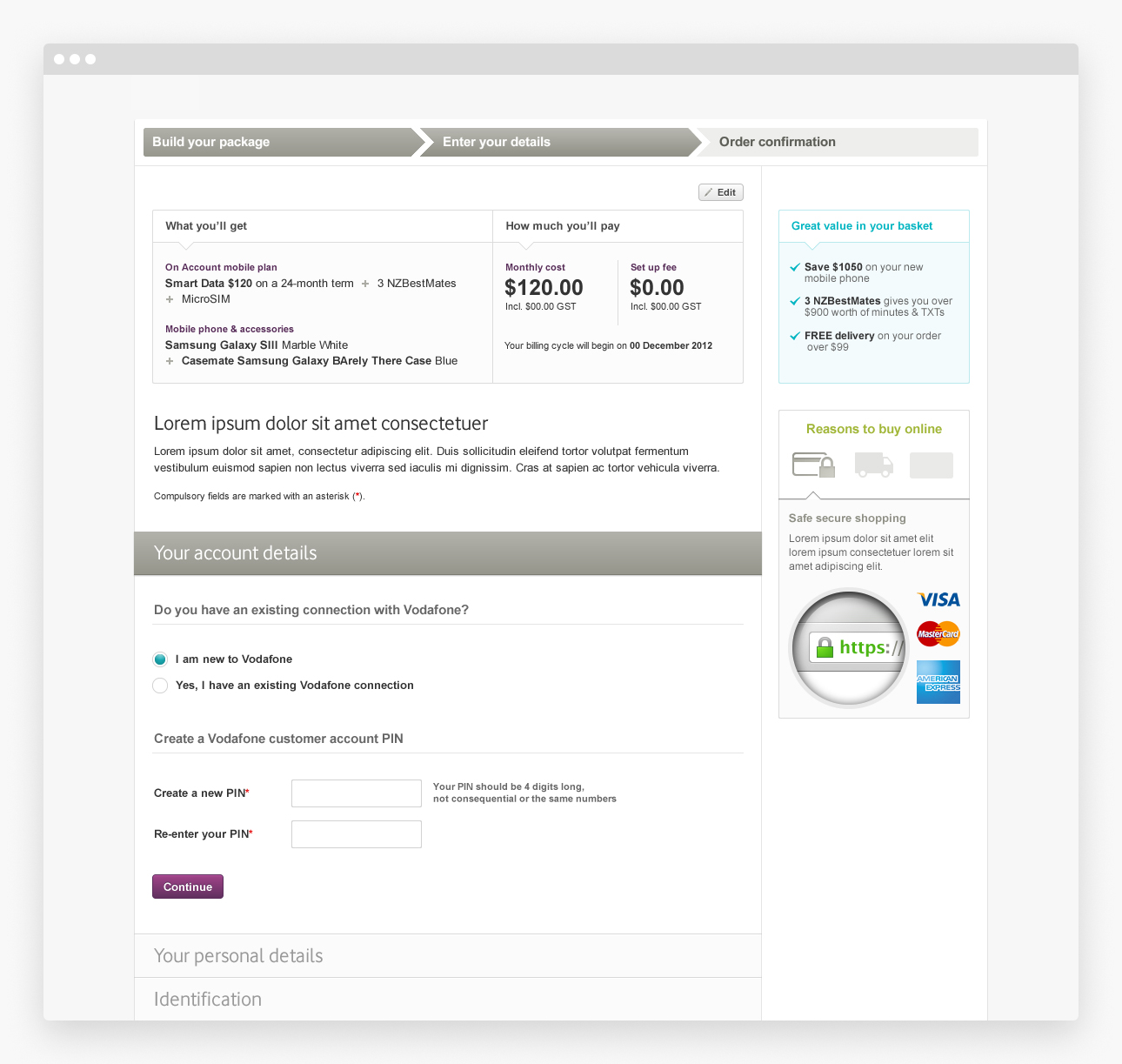 Broadband Package Builder
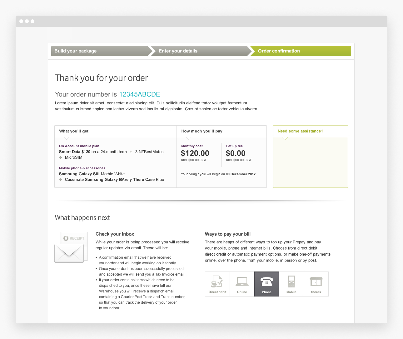 Broadband Package Builder
 Email template
 Email template
 Email template
Another big project included new ways to present Vodafone's dizzying array of mobile plans; prepay offerings in particular were largely driven by what competitors were doing and Vodafone offered a prepay plan to directly compete with every single one from Telecom (now Spark) and 2degrees. These pages needed to act as comparison charts and include legal notices, features & benefits of the Vodafone network, and brand reinforcement messages along with above–the–line creative.
The first solution was to re–order the comparison charts vertically, and use gradiented borders that would fade out from view once the page has completed loading but would fade in as the user moused over each column. Legal information and casual calling rates were somewhat hidden from view with expanding modules.
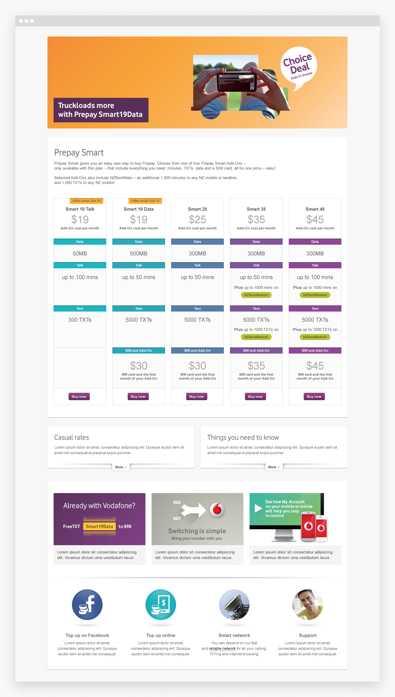 Prepay Smart mobile plan page with comparison chart
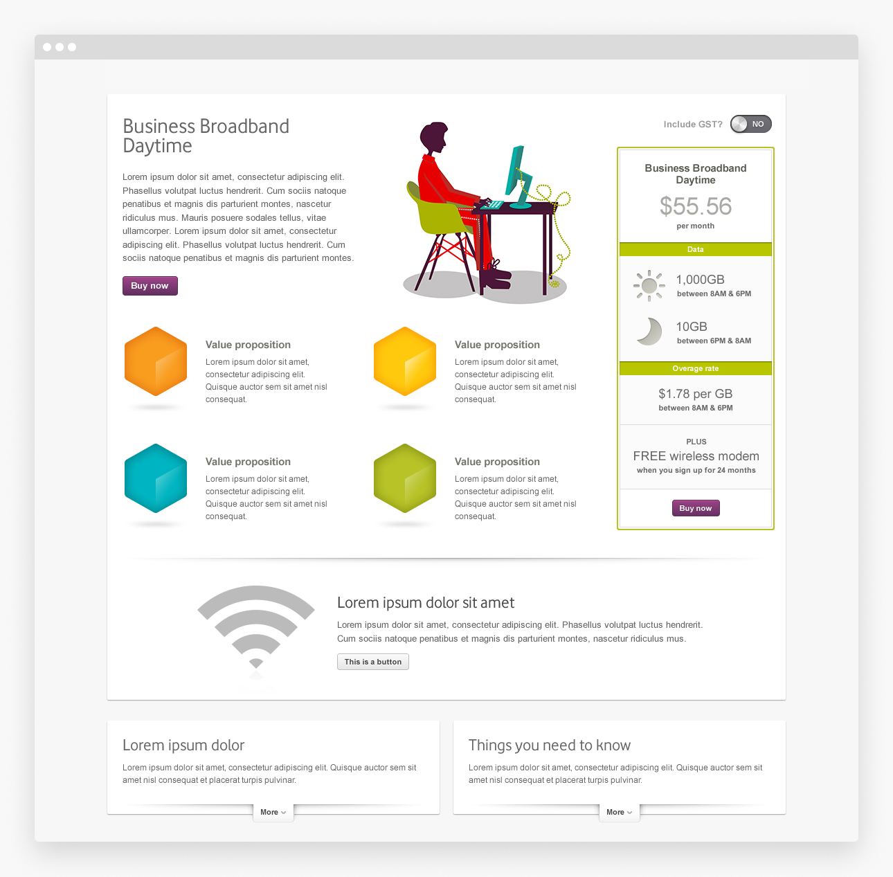 Business Broadband plan page
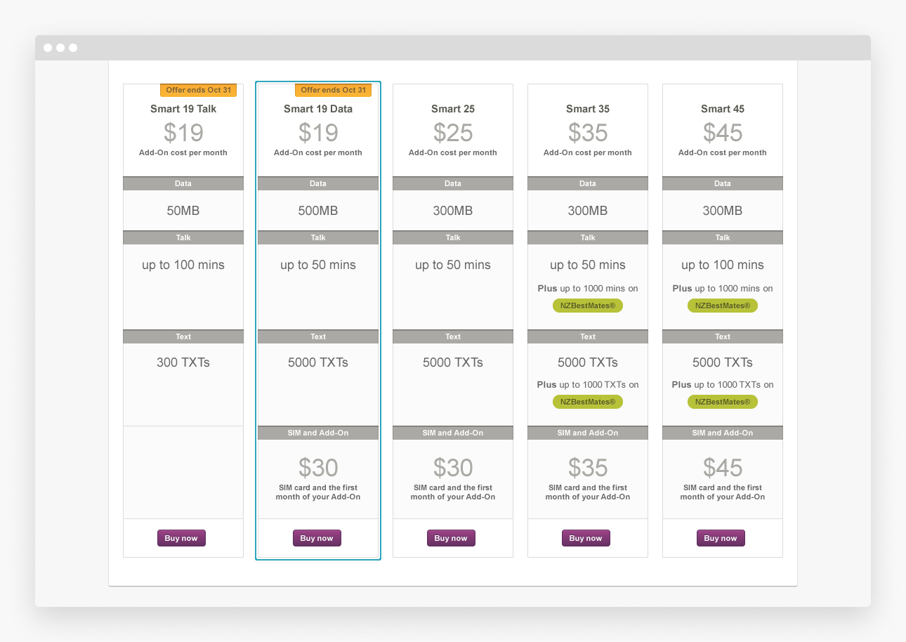 Plan comparison chart
 Media library page