The Creative Bureau is the design practice of Theunis Groenewald
—a designer & art director based in King Country, Aotearoa
Recent work
WasteCo


Following a successful reverse listing to the NZX and a massive push into the North Island by the acquisition of Civic Waste, WasteCo needed a realignment of their brand, and a new website to showcase their comprehensive service offering.
With a fleet of over 400 vehicles, and thousands of branded bins and skips, we opted for evolution over a revolution of the brand assets. The revised logotype and brand icon isn’t rolling out just yet, but a new proposition, a brighter orange and an expanded colour palette combine with a set of new typefaces and illustrations to help WasteCo deliver on its promise of cleaner environments across Aotearoa.
Full case study coming soon.
RabbitHawk
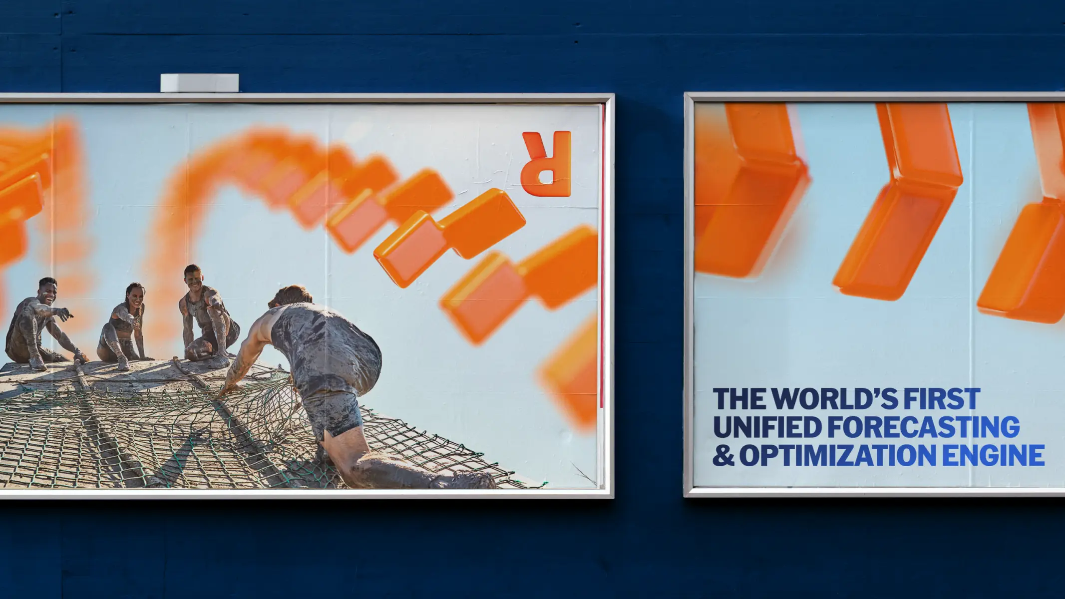
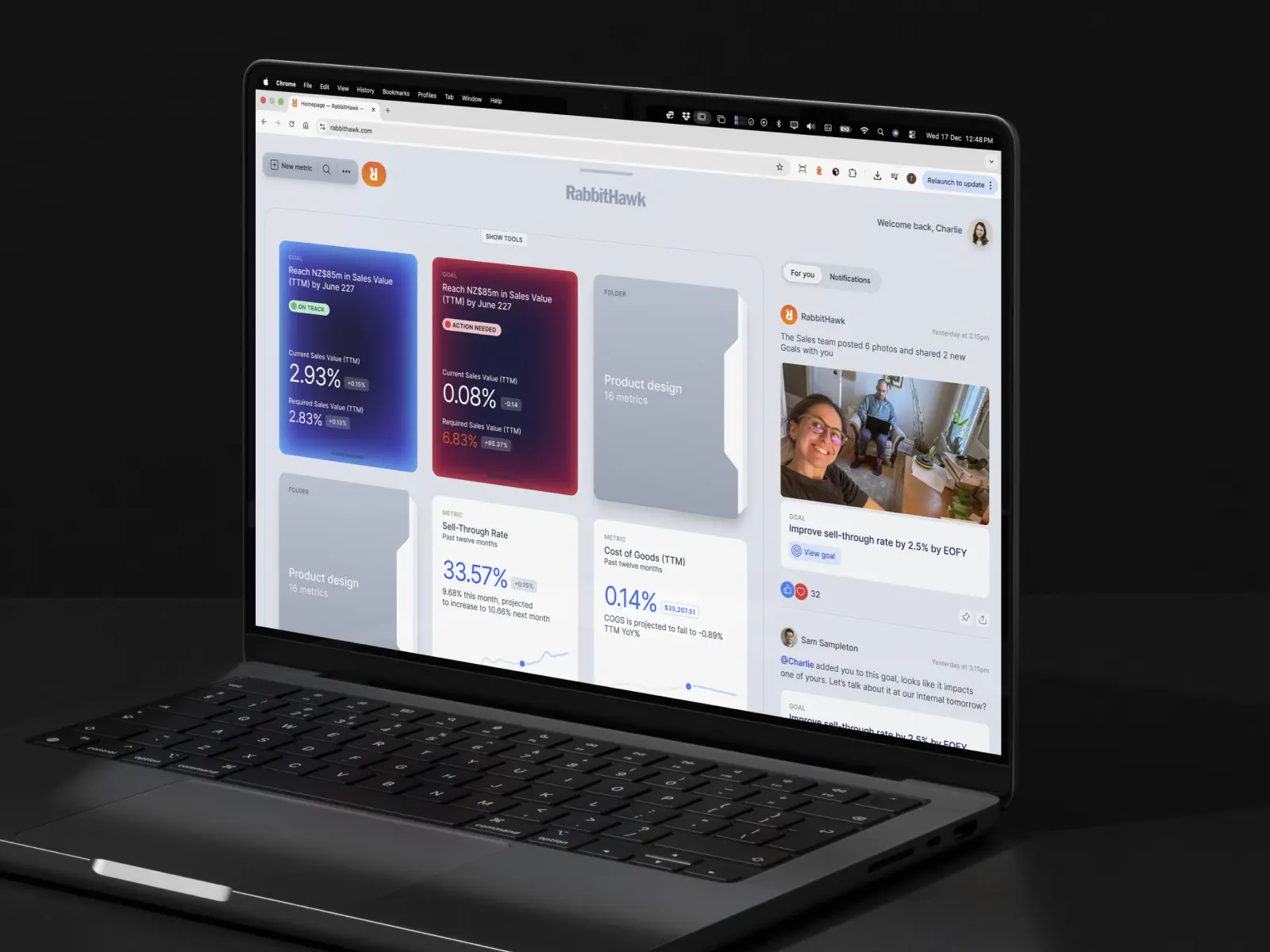
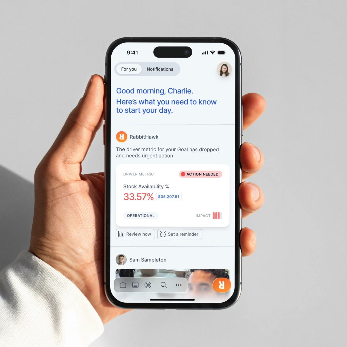
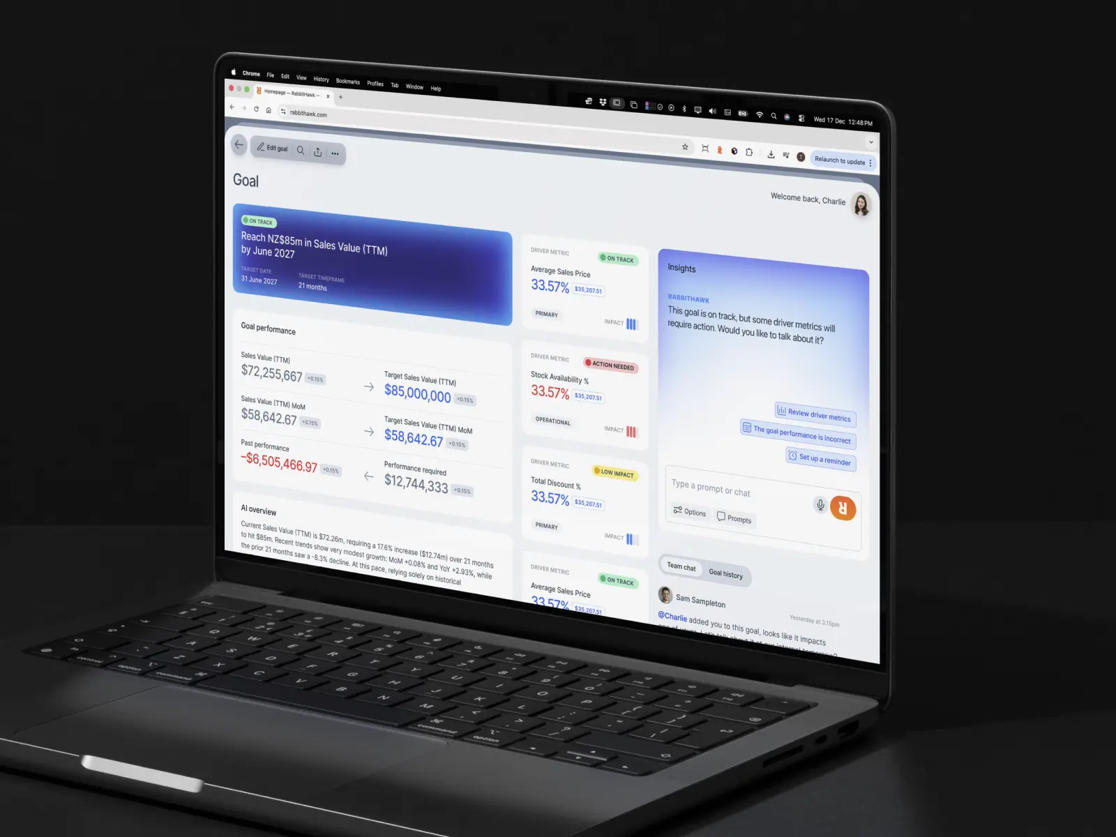
RabbitHawk is a unified, multi-agent forecasting and optimisation engine for a multitude of industries, with a particular focus on retail applications.
This is an ongoing project, with a full case study coming soon.
DC220

Datacentre220 needed a new site that better reflected their service and set the stage for an upcoming partner marketplace.
While making the switch from Wordpress to Webflow, the DC220 brand was also refined with a minimal new colour palette of blacks, white and an electric teal. A single weight of Commercial Type’s Neue Haas Grotesk serves as the new brand typeface, which also became the foundation for the revised logotype.
Being AI
Being AI is a diversified AI services development & investment group, operating three divisions: Being Consultants, Being Labs, and Being Ventures.
A successful overnight pitch resulted in a collaboration that lasted almost two years, and included setting up an in-house marketing team; delivering brand collateral, event merchandise, annual reports, user interface designs, and podcast production.
Tymestack
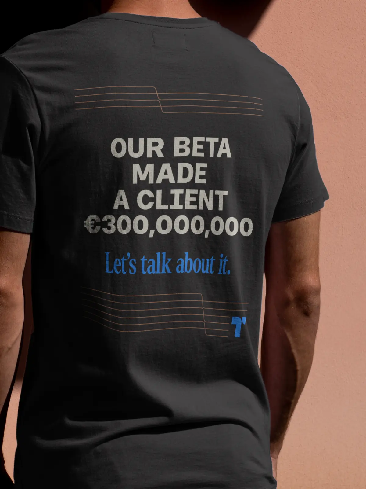
Tymestack is a price optimisation & forecasting tool, developed by a small team of world leaders in forecasting. That’s not an exaggeration, and it’s been a thrilling experience to be part of such an expert team.
Positioned as a challenger brand from the outset, the first brand outing was to a retail expo in Barcelona, where some arresting t-shirts made an impression. The brand and product have both evolved drastically over time, but the logotype—set in Denton—and icon haven’t changed.
Being Ventures
Being Labs launched a number of initiatives, including Project Treehouse—Being’s agentic AI marketplace solution.
Being Ventures includes a number of acquisitions, such as logistics company G3—which was rebranded to Send Global—and a number of education properties, including Mt Hobson Academy, and the new venture Manawaroa Education and its proposed charter school, Ascend. As part of Being AI’s in-house marketing team, we oversaw the creation of the new brands, and facilitated brand updates to the organisation’s acquisitions.
Happy Cow Milk Co
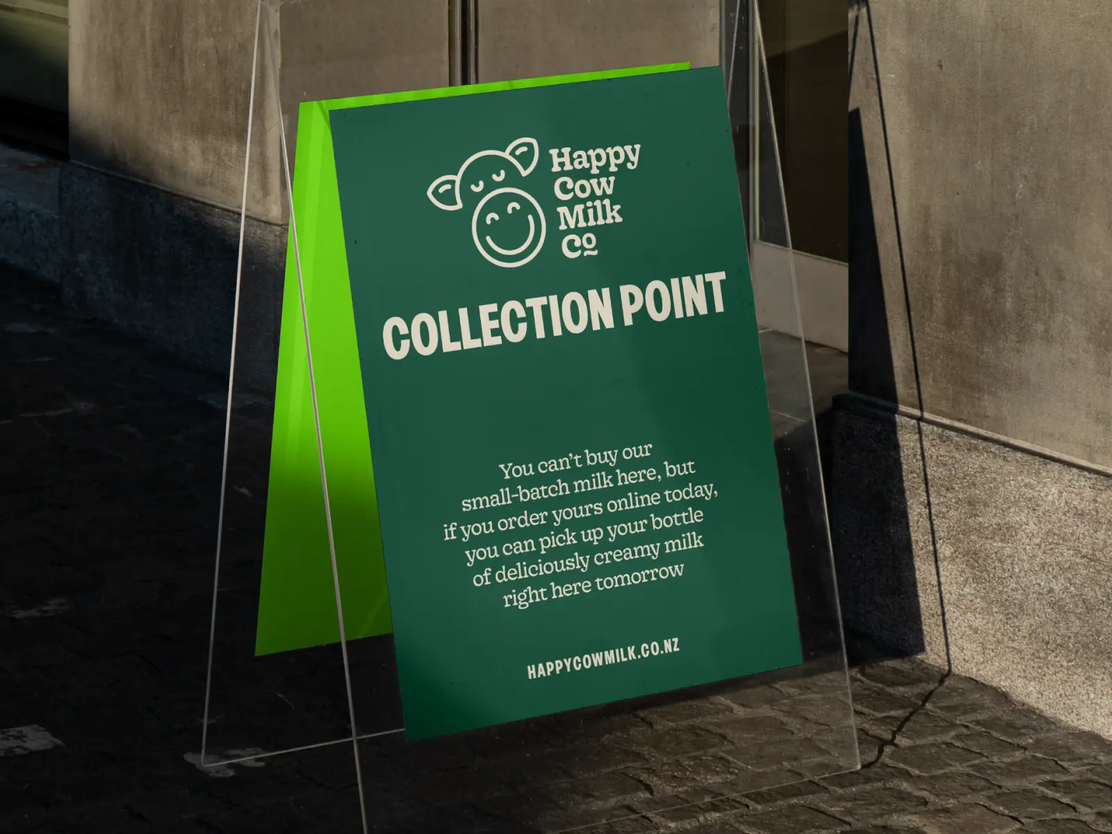
Glen’s passion for sustainable small-scale dairy farming that put cows’ and calves’ wellbeing at the forefront led to the Happy Cow Milk Company: offering fresh, pasteurised milk delivered to local collection points across Auckland in reusable glass bottles.
We helped refine the UX of their custom ordering system, reimagined their brand while keeping the icon largely intact, and helped to shape a new value proposition to both customers and potential investors of Glen’s mobile Milk-Factory-In-A-Box.
Nextspace
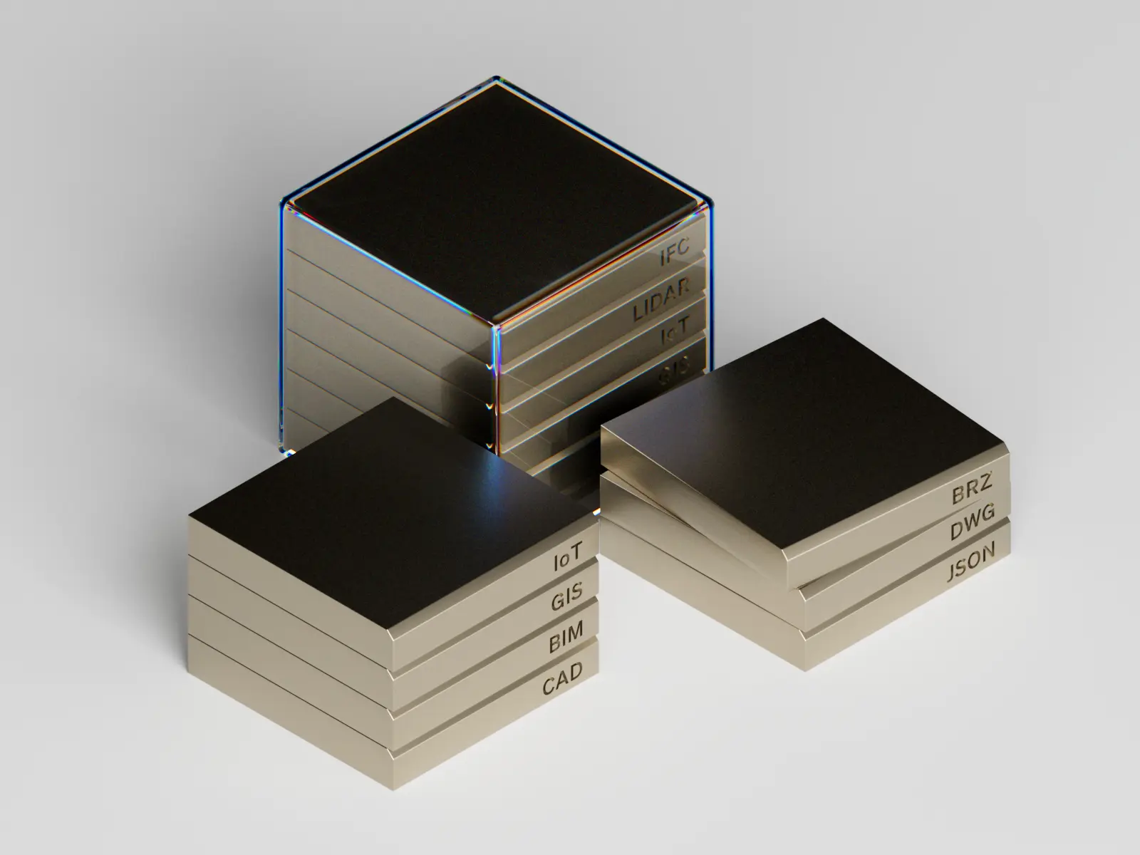
Initially, our involvement with Nextspace was to help them put together investor collateral for their Convertible Note raise—first and foremost, by helping them position their incredibly complex product offering to anyone who isn’t a data scientist. We then turned our attention to Nextspace’s brand and visual identity, while getting schooled on data ontology and integration during an intensive digital twin crash course.
Eighteen months later, we had helped them shed the project name Bruce in favour of making Nextspace both the brand and product; renew their focus on the visual Navigator, which saw the adoption of Unreal Engine and NVIDIA Omniverse; created a library’s worth of guided videos; and deliver a new website experience that allowed online signups for the first time.
Nextspace UI
While the Nextspace team was rightly focused on the Administrator function of their product—the tool that enabled deep data integration for the creation of advanced digital twins—we helped them see the value of their Navigator tool; the visual, 2D & 3D explorer that brought digital twins to life.
As new, more powerful visualisation tools like Unreal Engine and NVIDIA Omniverse were included, the team launched a brand new Navigator. Our task was to streamline the user experience, and simplify the interface that had become bloated through years of incremental updates and feature additions.
Boxer brand
What was originally a design brief to refresh the existing LocalCover cross-border warranty service, led to a complete overhaul of the entire service product offering, market positioning and brand to become Boxer, offering local backup for global shoppers.
Through a series of internal and external research workshops, we developed a set of brand values and personality traits all embodied by the dog breed that would become the brand name. Fittingly, the CEO’s previous dog was a mixed Boxer breed, and the resulting brand icon features her distinctive ear.
As part of the in-house team for over two years, we delivered a new brand, staff engagement programme, website and marketing collateral, explainer videos, investor material, retail partner implementation guidelines, and more.
Boxer UI
Because the Boxer shopper service isn’t a traditional warranty product, it gave us the opportunity to build a new kind of user experience, free from long, complicated forms and nonsense questionnaires. Instead, we shifted to a series of short, multi-step modals to collect only the relevant information required to complete any given step in the resolution process—providing the flexibility to cover any number of product categories and retail sectors. This meant much shorter, more frequent, customer interactions.
Beyond a complete UI component & pattern library, we created a visual language that turned purchased covers into real objects, stored in a variety of boxes within each account; physical icons were cut out of plywood, then painted by the development team in the office, and photographed.
More from The CB
A forthcoming publication, covering the Australasian brands we engage with often, and the things we’d love to see them do better